- What is the Lorenz Curve?
- How to Draw the Lorenz Curve
- The Lorenz Curve Formula with Example
- Advantages and Disadvantages of the Lorenz Curve
- Gini Coefficient and the Lorenz Curve
- Implications of Inequality Measured by the Lorenz Curve
- Frequently Asked Questions (FAQs)
What is Lorenz Curve? Definition, Formula, Gini Coefficient & More

Have you ever wondered about the importance of how income is distributed within a population? Knowing how income is distributed, policymakers and economists can assess the level of inequality in society and design appropriate measures to address it. This is where the Lorenz Curve comes into play.
What is the Lorenz Curve?
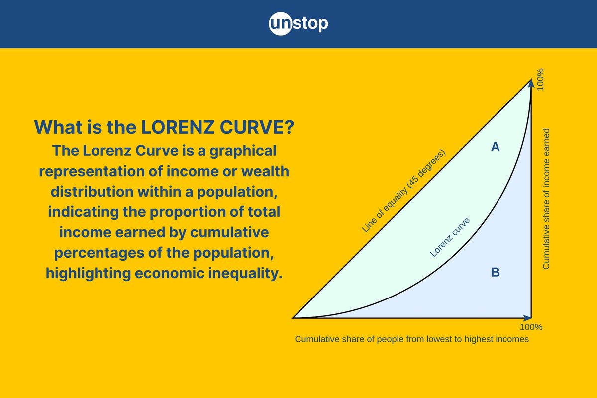
The Lorenz curve is a graphical representation developed by American economist Max O. Lorenz in 1905 to measure inequality within a population. It provides a visual depiction of the distribution of income, showing the cumulative percentage of total income received.

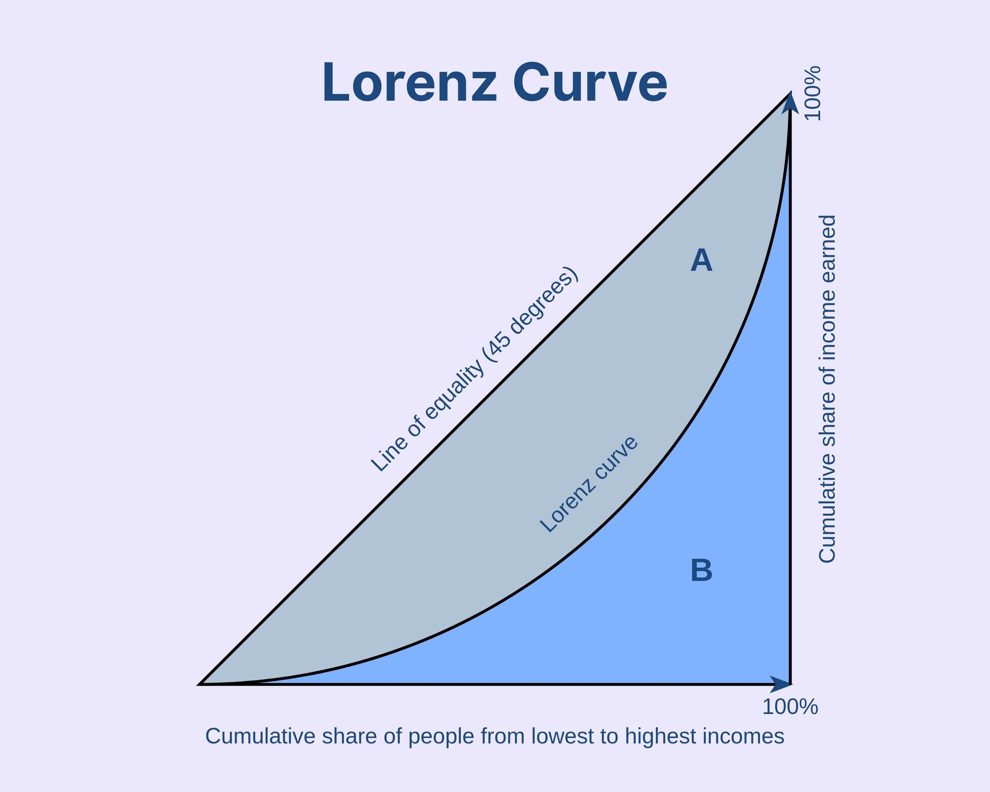
A 45-degree line showing perfect equality represents the line of equality. If everyone has the same income, the Lorenz curve would lie on this line. The curve's slope represents the extent of inequality, with steeper curves indicating greater disparities in income distribution. The greater the distance between the Lorenz curve and the 45° line, the greater the inequality.
How to Draw the Lorenz Curve
To estimate the Lorenz Curve, you will need data on individual incomes and their corresponding frequencies. With this information, you can plot points on a graph to create the curve. Let's dive into the process of estimating the Lorenz Curve and understand its significance in visualizing income inequality.
Individual Incomes and Frequencies
The first step in estimating the Lorenz Curve is gathering data on individual incomes. This data should include information about how frequently each income level occurs within a given population. For example, if we have a dataset of 100 individuals, we need to know how many people fall into each income bracket.
Plotting Points on a Graph
Once you have the required data, it's time to plot points on a graph. The x-axis represents cumulative proportions or percentages of total population, while the y-axis represents cumulative proportions or percentages of total income. Each point on the graph corresponds to a specific cumulative proportion of individuals and their corresponding cumulative proportion of income.
Visualizing Income Inequality
The estimated Lorenz Curve provides a visual representation of income inequality within a population. It helps us understand how wealth is distributed among different groups by showing deviations from an ideal line called the "line of perfect equality." The greater the distance between the Lorenz Curve and this line, the higher the degree of income inequality.
Gini Coefficient
The Gini coefficient, or Gini Index, is a measure of income inequality within a population. It is a statistical indicator that ranges from 0 to 1, with 0 representing perfect equality and 1 representing maximum inequality. It’s used in relation to the Lorenz Curve to express the extent of inequality.
The Gini index is calculated by dividing the area between the Lorenz Curve and the line of perfect equality (where income is equally distributed) by the total area under the line of perfect equality.
The Lorenz Curve Formula with Example
There’s no single Lorenz Curve formula. The method for calculating the Lorenz curve depends on the available data. A common and simple method for calculating the Lorenz Curve is as follows:
-
Sort the population in ascending order based on income.
-
Calculate the cumulative percentage of the population by dividing the number of individuals below a certain income threshold by the total population size and multiplying by 100.
-
Calculate the cumulative percentage of total income by dividing the sum of incomes below a certain income threshold by the total income of the population and multiplying by 100.
-
Plot the cumulative percentage of the population and the cumulative percentage of total income on the respective axis.
-
Connect the plotted points to form the Lorenz Curve. This curve visually depicts how income is distributed among different segments of society.
Example of Lorenz Curve
Imagine a population of 5 people in a village, and their incomes are:
Step 1: Arrange from lowest to highest income
|
Person |
Income (in INR) |
|
A |
1,000 |
|
B |
2,000 |
|
C |
3,000 |
|
D |
4,000 |
|
E |
10,000 |
Step 2: Calculate cumulative income and population share
|
Person |
Income (INR) |
Cumulative Population (%) |
Cumulative Income (INR) |
Cumulative Income (%) |
|
A |
1,000 |
20% |
1,000 |
5.56% |
|
B |
2,000 |
40% |
3,000 |
16.67% |
|
C |
3,000 |
60% |
6,000 |
33.33% |
|
D |
4,000 |
80% |
10,000 |
55.56% |
|
E |
10,000 |
100% |
20,000 |
100% |
Step 3: Plot the points
- (0%, 0%)
- (20%, 5.56%)
- (40%, 16.67%)
- (60%, 33.33%)
- (80%, 55.56%)
- (100%, 100%)
These points will create a curve below the Line of Equality, showing income inequality, indicating that the further the Lorenz Curve is from the Line of Equality, the greater the inequality. If the curve is very close to the equality line, it indicates that there is more equality.
Advantages and Disadvantages of the Lorenz Curve

Advantages of the Lorenz Curve
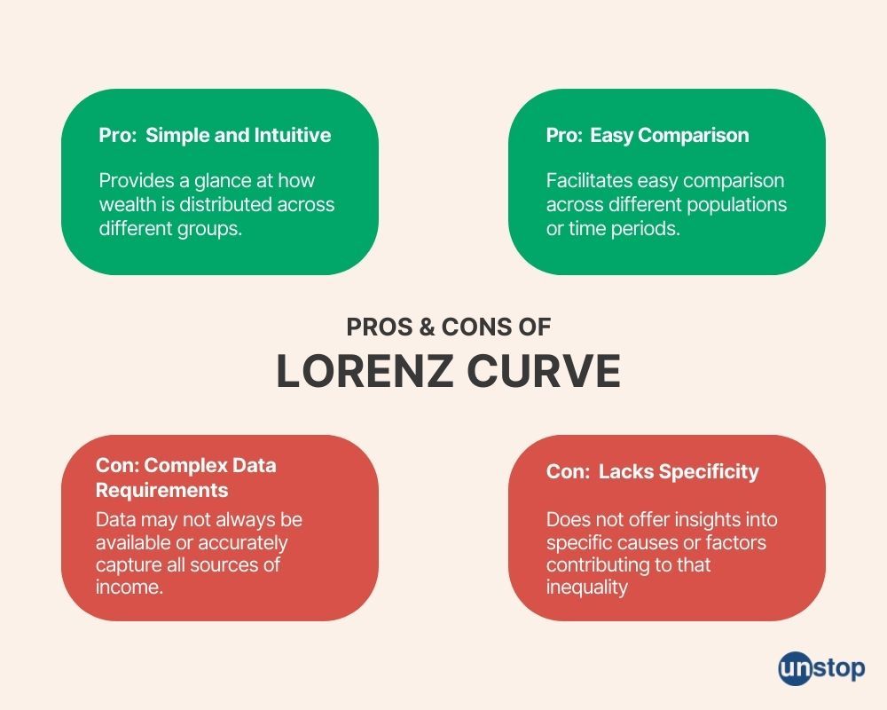
Simple and Intuitive: The Lorenz Curve provides a straightforward way to visualize and interpret income distribution within a population. It plots the cumulative share of total income against the cumulative share of the population, allowing us to see at a glance how wealth is distributed across different groups.
Easy Comparison: One of the key strengths of the Lorenz Curve is its ability to facilitate easy comparison across different populations or time periods. By plotting multiple curves on the same graph, we can compare income distributions between countries and regions over time, helping us identify disparities and trends in inequality.
Disadvantages of Lorenz Curve
While the Lorenz Curve has its benefits, it also comes with limitations that need to be considered when interpreting its findings.
Challenging Data Requirements: The accuracy of the Lorenz Curve depends on having reliable data on individual incomes. However, obtaining precise information about everyone's earnings can be challenging in practice. In some cases, data may not be available or may not accurately capture all sources of income (e.g., informal economy), which can affect the reliability of the curve's representation.
Lack of Specificity: Although the Lorenz Curve provides an overview of income inequality within a population, it does not offer insights into specific causes or factors contributing to that inequality. It does not reveal whether disparities arise from differences in education levels, discrimination, government policies, or other factors influencing income distribution.
Gini Coefficient and the Lorenz Curve
The Gini Coefficient and the Lorenz Curve are essential tools for understanding income distribution and inequality. By analyzing data using the Lorenz Curve and Gini Coefficient, governments, organizations like the World Bank, and researchers gain insights into wealth disparities within societies.
Gini Coefficient Interpretation
The Gini coefficient provides a concise summary of the distribution of income within a population. It takes into account the entire distribution rather than just focusing on specific points or percentiles. It allows us to compare income inequality across different populations or time periods.
By calculating the area between the diagonal line of perfect equality and the Lorenz curve and dividing it by the total area under the diagonal line, we obtain the Gini coefficient. It quantifies income inequality on a scale from 0 to 1, where 0 represents perfect equality and 1 signifies extreme inequality. Here's how to interpret it:
Values close to zero suggest a more equal distribution of income among individuals.
Values closer to one indicate high levels of inequality, with a small portion of individuals holding a large share of total income.
Lorenz Curve Interpretation
The Lorenz Curve is a graph that compares the cumulative share of total income earned by different segments of the population. Here's how to interpret it:
The closer the curve is to the diagonal line, the closer we are to perfect equality in income distribution.
If the curve deviates significantly from the diagonal line, it indicates higher levels of inequality.
For example, if Country A has a Gini Coefficient of 0.2 and Country B has a coefficient of 0.6, we can conclude that Country A has relatively lower levels of income inequality compared to Country B. Understanding these interpretations allows us to assess and compare income distributions across different populations or countries.
Implications of Inequality Measured by the Lorenz Curve

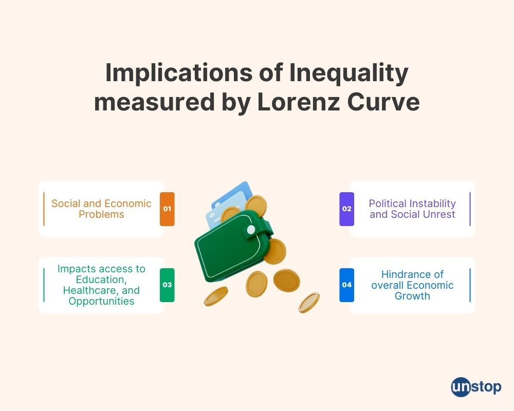
High-income inequality, as measured by the Lorenz curve, can have significant implications for society and the economy:
Social and Economic Problems
When there is a large gap between the incomes of different individuals or groups, it can lead to social and economic problems. This means that some people have much more wealth and resources than others, which can create tension and division within society.
Impact on Access to Education, Healthcare, and Opportunities
Inequality in income distribution can directly impact access to essential services such as education and healthcare. Those with lower incomes may struggle to afford quality education or proper healthcare, limiting their opportunities for upward mobility.
Political Instability and Social Unrest
A widening wealth gap has been linked to political instability and social unrest. When a significant portion of the population feels marginalized or excluded from economic opportunities, it can lead to protests, demonstrations, or even conflicts.
Hindrance of Overall Economic Growth
Inequality can hinder overall economic growth. When wealth is concentrated in the hands of a few individuals or groups, there is less money circulating in the economy. This reduces consumer spending power and slows down economic activity.
Conclusion
In conclusion, exploring insights from the Lorenz curve analysis offers a deeper understanding of income distribution and inequality within a society. By utilizing this methodology alongside other measures, policymakers can make informed decisions to address inequities effectively. It is crucial to recognize both the strengths and limitations of this approach when formulating strategies to promote more equitable societies.
Frequently Asked Questions (FAQs)
Q1. What does the Lorenz curve represent?
The Lorenz curve represents income distribution within a population by plotting cumulative shares of total income against cumulative shares of households or individuals ranked by their income levels. It provides a graphical representation that shows how much each percentile group receives in relation to others.
Q2. How are the Lorenz curve and Gini coefficient related?
The Gini coefficient is derived from the Lorenz curve analysis. It quantifies income inequality by measuring how far apart actual income distribution is from perfect equality on a scale from 0 to 1. A higher Gini coefficient indicates greater inequality.
Q3. What are some advantages of using the Lorenz curve?
The Lorenz curve offers a visual representation of income distribution, making it easy to interpret. It helps policymakers and researchers identify disparities in wealth and income, enabling them to formulate targeted interventions. The Lorenz curve can be used to compare inequality across different countries or regions.
Q4. Are there any limitations to using the Lorenz curve?
Yes, there are limitations. The Lorenz curve focuses solely on income distribution and does not capture other dimensions of inequality, such as access to education, healthcare, or social mobility. It also assumes that households with similar incomes have similar living standards, which may not always be the case.
Q5. How can insights from the Lorenz curve analysis inform policy decisions?
Insights from the Lorenz curve analysis can guide policymakers in designing targeted interventions to reduce inequality. By understanding the specific areas where disparities exist, policymakers can implement measures that address these gaps effectively and promote more equitable societies.
Q6. Can the Lorenz curve analysis be applied to measure inequality in non-income contexts?
While the Lorenz curve is commonly used for income distribution analysis, its methodology can also be adapted to measure inequalities in other contexts, such as access to education or healthcare. However, it is important to consider whether this approach adequately captures all relevant dimensions of inequality in each specific context.
Q7. How frequently should the Lorenz curve analysis be conducted?
The frequency of conducting a Lorenz curve analysis depends on various factors, such as data availability and policy objectives. Ideally, regular assessments should be carried out to monitor changes in income distribution over time and evaluate the effectiveness of policies aimed at reducing inequality.
Suggested Reads:
- Liquidity Trap Decoded: Definition, Causes, and Solutions
- What Is A Bear Market?: A Detailed Guide To Navigating It Along With Investing Tips
- What is Recession? Delving Deeper Into The Causes With Examples
- Likert Scale Explained (With Examples): Learn To Use This Popular Survey Tool
- Economies Of Scale: Definition, Types, Benefits & Examples
I’m a reader first and a writer second, constantly diving into the world of content. If I’m not writing or reading, I like watching movies and dreaming of a life by the beach.
Login to continue reading
And access exclusive content, personalized recommendations, and career-boosting opportunities.
Subscribe
to our newsletter


Comments
Add comment