- What is CSS?
- CSS interview questions
- Conclusion
60+ Important CSS Interview Questions With Answers (2026)
It should come as no surprise that businesses in today's market are actively seeking to fill open positions with young and skilled software engineers. But there are so many talented developers out there; how can you differentiate yourself from everyone else who is applying for these highly sought-after positions? The most effective method for achieving this goal is to become proficient in the talents that are in high demand by employers, specifically a diverse set of programming abilities.
When looking to hire new employees, businesses consider the challenges faced by the organization as well as the opportunities presented by the individuals. Full stack developers are those who, according to the definition, are competent to work on both the backend and the frontend, as well as the protocols that connect the two; they are also capable of autonomously developing an entire software product from beginning to end. This is where CSS comes into the picture. For securing a high payable job at leading tech companies as a developer, you must learn CSS.
What is CSS?
The “Cascading Style Sheets” (CSS) language is a design language that can make a website appear more appealing than merely a collection of plain or uninteresting chunks of text. On the other hand, HTML is primarily responsible for determining the textual content of a document, while CSS is responsible for determining the visual structure, flexible layouts, as well as aesthetics of the document. Both HTML and CSS are considered markup languages; however, CSS is considered a style sheet language.
If HTML were the components of a car's engine, then CSS would represent the car's body style as well as the paint job. A website can function even if CSS is not used, but the result will not be attractive. A website's front end may shine when CSS is used, and users will have a far more positive experience as a result. Without “Cascading Style Sheets” (CSS), websites would appear less appealing to the eye and would likely be far more difficult to browse. The “Cascading Style Sheet” (CSS) is responsible for a variety of things, including layout and format, as well as the font color. Here, we are sharing a guide including all the essential CSS interview questions that you can prepare for.

CSS Interview Questions for Freshers
Go through these frequently asked CSS interview questions to nail the technical round:
1. Tell me about the box model in CSS and the properties associated with it.
An important concept for the construction of HTML web pages is the CSS box model. It describes how browser engines model HTML elements and how CSS characteristics determine the sizes of those HTML elements. The box model describes all the elements in an HTML document as rectangular boxes with their respective dimensions. These boxes have an actual content area and optional border, padding, and surrounding margin areas.
The following properties in CSS are a part of the box model:
Content: The text and picture material that is displayed in the box.
Padding: Makes room for the content around it.
Border: The padding and content are surrounded by a border.
Margin: Clears the space outside the border
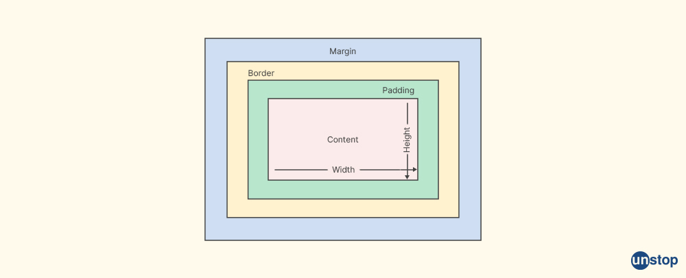
Developers can utilize these properties in CSS to define space between items, add a border around elements, and regulate the box model. They can also specify whether an element's width and height should include its padding and border using the box-sizing attribute.
2. Tell the benefits of using CSS.
Some benefits of using CSS are:
- CSS is time-saving: Since it is possible to write the elements once and reuse them across several HTML pages, each HTML element has a style that can be chosen and used on as many different Web sites.
- Simple to maintain: All elements across all the web pages update instantly if we change the style.
- International web standards: Attributes in HTML are getting disapproved these days, and are slowly getting replaced by CSS. Therefore, utilizing CSS in all HTML pages is a smart idea to ensure that they are compatible with upcoming browsers.
- Platform neutrality: The script provides continuous platform independence and is compatible with the newest browsers.
3. How is CSS limited?
- In CSS it is not necessary that what is working with one browser, will always work with another browser. So, The program must be tested for compatibility by web developers using a variety of browsers.
- If any compatibility issues arise after making the changes, we must verify them. All browsers are affected by the same change.
- On various browsers, CSS functions differently. CSS is supported in different ways by IE and Opera. When using CSS, cross-browser difficulties can arise.
- The availability of security is limited in CSS.
4. How to include CSS in the webpage?
There are three ways to include CSS in the webpage, they are - External Style Sheet, Internal CSS, and Inline CSS.
External Style Sheet - One needs to create separate files for these sheets, and then link them to an HTML document with the <link> element that exists in the <head> section. This is one of the most popular approaches.
Example:
<link rel="stylesheet" type="text/css" href="mystyles.css" />
Internal CSS - It involves placing the CSS code inside a <style>element in the HTML document's <head> section.
Example:
<style type="text/css">
/*Add style rules here*/
</style>
Inline CSS - It entails explicitly putting the inline style property on the HTML element.
Example:
<h2 style="color:brown;background:red">Inline Style</h2>
5. Tell the kinds of selectors available in CSS.
The HTML elements that we want to style are chosen using different types of selectors, which are patterns.
There are 5 types of Selector: Simple selectors, combinator selectors, pseudo - classes selectors, pseudo - element selectors, and attribute selectors.
Simple selectors: Elements are selected based on name, id, class, or attribute.
Combinator selectors: They allow users to choose components based on the relationships between them, like descendant selectors, child combinators, and adjacent sibling combinators.
Pseudo-classes selectors: We can choose elements using this selector based on a specific state such as :hover, :active, and :focus.
Pseudo-element selectors: It means selecting and styling a part of an element.
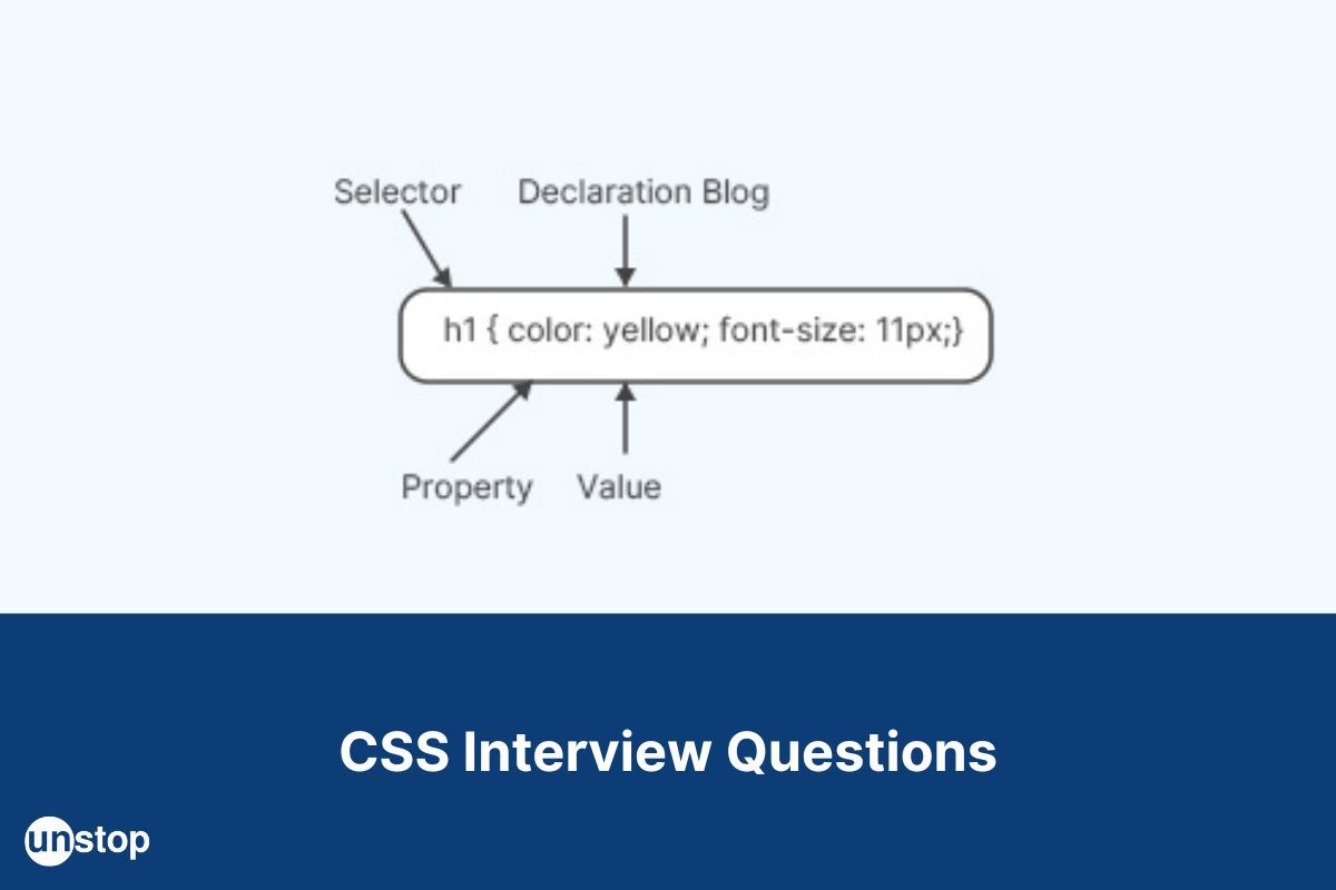
Attribute selectors: Elements can be chosen using attribute selectors based on an attribute or an attribute value such as [type="text"] and [href].
6. Describe CSS preprocessor?
A CSS pre-processor is a program that increases the capabilities of a standard CSS using more logical syntax like variables, if/else statements, code nesting, loops, and mathematical operations. CSS preprocessors make it simple to automate monotonous activities, lower the number of errors and code duplication to produce reusable code snippets, and guarantee backward compatibility. They make it possible for programmers to write CSS that is more efficient powerful, and dynamic.
So, to enable client-side rendering by browsers, each CSS pre-processor will have a unique CSS syntax that is translated into standard CSS. Sass, Less, and Stylus are a few well-liked CSS preprocessors.
7. Do you know about Sass, Less, and Stylus?
Yes, Sass, Less, and Stylus are the most widely used CSS preprocessors.
Sass: The full form of Sass is Syntactically Awesome Style Sheets.
It has two syntax options. SASS syntax and SCSS syntax.
The SASS syntax which is also called indented syntax uses indentation to divide the code blocks and newline characters to divide rules. It uses the .sass extension.
Example of SASS syntax:
$font-stack: "Arial", sans-serif;
body
font: 100% $font-stack;
color: $primary-color;
The SCSS syntax employs block formatting which is similar to CSS. It uses a .scss extension.
Example for SCSS syntax:
$font-stack: "Arial", sans-serif;
body {
font: 100% $font-stack;
color: $primary-color;
}
Less: It stands for Leaner Style Sheets. With the help of the LESS CSS preprocessor, we can use features like variables, nesting, mixins, etc. in a syntax that is consistent with CSS bootstrap3 that makes use of LESS. Learning LESS is simple because it resembles CSS.
Syntax:
@font-stack: Helvetica, sans-serif;
@primary-color: #333;
body {
font: 100% @font-stack;
color: @primary-color;
}
Stylus: Stylus is a preprocessor language for dynamic stylesheets that are compiled into Cascading Style Sheets (CSS). Stylus is created with JADE and NODE.js. Stylus is a powerful, expressive, and feature-rich CSS language that is built specifically for Node.js. It is equipped with incredibly powerful built-in features and has the processing power to handle intensive computation.
Stylus uses .styl extension and it provides a great deal of syntax flexibility, supports native CSS, and allows the omission of brackets, colons, and semicolons. It does not define variables by using the @ or $ symbols. Instead, it indicates a variable declaration using the assignment operators.
8. Do you know about VH/VW (viewport height/ viewport width) in CSS?
Viewport height (VH) and viewport width (VW) are the relative units of measurement in CSS which are based on the viewport's dimensions.
VW is a percentage of the viewport width, whereas VH is a percentage of the viewport height.
For example, if we declare something as 2vw, and the viewport as 1600 pixels wide, it will be comparable to 2%, or 32 pixels, of the viewport width. These components are helpful for producing responsive designs that change according to the resolution and size of the screen. The majority of contemporary browsers support VH and VW.
9. How is reset different from normalise CSS?
There are two different methods by which we can establish a consistent baseline for web page styling. They are Reset CSS and Normalise CSS.
Reset CSS: The default values for various components on a web page can be reset using a reset CSS file, which is a collection of styles. The goal of resetting the CSS file is to give the web page a styling consistent starting point so that all elements are displayed uniformly across browsers and we don't have to waste time by erasing default browser styles.
Normalise CSS: The normalise CSS makes default styles consistent across various browsers. It helps us to make it simpler to style web pages consistently across various browsers, without totally eradicating the default styles of those browsers.
Instead of unstyling everything, normalise CSS helps us in fixing several frequent issues that reset CSS is unable to address. If we compare it to reset CSS, normalise CSS has a broader reach and doesn't clog the dev tools window.
10. Explain inline, inline-block, and block.
Inline: HTML elements are placed adjacent to an inline element without causing a line break before or after it.
Inline-block: An inline-block element is positioned as an inline element, on the same line as adjacent content, but it functions as a block element. The element can also reside next to other elements in a line because it supports setting both width and height and it does not add a line break after the element.
Block: A block element does not accept any HTML elements adjacent to it and has some whitespace above and below it. It occupies the entire width and begins on a new line.
While inline and inline-block components are handy for creating text and inline content, the block elements are excellent for designing page layouts.
11. Why it is necessary or important to test the webpage in different browsers?
It is crucial to test the website with several browsers to make sure that the website functions properly across many browsers and gadgets. This is termed cross-browsing. Through cross-browser testing, websites are made to perform flawlessly on all major browsers and mobile platforms.
12. Tell me what you mean by Pseudo elements and Pseudo-classes.
Pseudo-elements: Specific portions of an element can be styled using a CSS pseudo-element. It performs the role of a sub-element and gives the chosen element more features.
For example, if we want to give the first line of a text a unique style, we use the ::first-line pseudo-element.
The first line of the text is formatted as shown in the example below for all< p> elements:
p::first-line { color: #ff0000; font-variant: small-caps; }.
Pseudo-classes: It is a selector's keyword that specifies a specific state for the selected element or elements in CSS. In short, Pseudo-classes are used to specify an element's specific states.
For example, the pseudo-class :hover can be used to select a button when a user's pointer hovers over the button and this selected button can then be styled.
Pseudo-classes enable us to apply a style to an element based on external variables like the navigator's history, the state of its content, or the mouse location in addition to the content of the document tree.
13. What are units in CSS?
There are two types of units in CSS. They are absolute and relative.
Absolute units are constant and independent of the context.
Like Pixels (px), Inches (in), Centimetres (cm), Millimetres (mm), Points (pt), and Picas (pc).
Relative units are based on the relationship between length and another length property.
Like em, rem, vw, vh, vmin, and vmax. The rem unit is relative to the root element's font size, whereas the em unit is relative to the element's font size.
The vw and vh units are proportional to 1% of the viewport's width and height, respectively.
14. Will there be an effect on inline elements because of margin-top or margin-bottom?
No, margin-top and margin-bottom do not have an effect on inline elements. Inline elements flow with the content on the page, and margin-top or margin-bottom would disrupt the flow of content.
15. Name the property used for changing the font face.
The font family property is used for changing the font face. A prioritized list of font families is defined by the font-family property, which applies to an element.
Syntax:
@font-face {
font-family: fontName;
src: url(fontFile path);
font-stretch: font-stretch Property;
font-weight: font-weight Property;
font-style: font-style Property;
}
Example of HTML code using @font-face rule:
HTML SNIPPET IS HEREPCFET0NUWVBFIGh0bWw+Cgo8aHRtbD4KCjxoZWFkPgoKICAgIDxzdHlsZT4KICAgICAgICBAZm9udC1mYWNlIHsKCiAgICAgICAgICAgIGZvbnQtZmFtaWx5OiBteUN1c3RvbUZvbnQ7CgogICAgICAgICAgICBzcmM6IHVybCgncGF0aC90by9mb250LndvZmYyJykgZm9ybWF0KCd3b2ZmMicpLAoKICAgICAgICAgICAgICAgIHVybCgncGF0aC90by9mb250LndvZmYnKSBmb3JtYXQoJ3dvZmYnKTsKCiAgICAgICAgICAgIC8qIEFkZGl0aW9uYWwgZm9udCBwcm9wZXJ0aWVzICovCgogICAgICAgICAgICBmb250LXN0eWxlOiBpdGFsaWM7CgogICAgICAgICAgICBmb250LXdlaWdodDogYm9sZDsKCiAgICAgICAgfQoKICAgICAgICBoMSB7CgogICAgICAgICAgICBmb250LWZhbWlseTogbXlDdXN0b21Gb250LCBzYW5zLXNlcmlmOwoKICAgICAgICB9CiAgICA8L3N0eWxlPgoKPC9oZWFkPgoKPGJvZHk+CgogICAgPGgxPlRoaXMgaXMgVW5zdG9wPC9oMT4KCiAgICA8cD5CZSBVbnN0b3BwYWJsZS48L3A+Cgo8L2JvZHk+Cgo8L2h0bWw+
OUTPUT:
This is Unstop
Be Unstoppable.
16. Distinguish between adaptive design and responsive design.
|
Adaptive Design |
Responsive Design |
|
Adaptive design is a type of web design whereby the browser window loads a layout created specifically for the given platform. |
Responsive design is a fluid approach where a page rearranges itself based on the detected screen size or browser window. |
|
It uses multiple fixed layouts that are designed for specific screen sizes and resolutions. |
It uses a single layout that adapts to different screen sizes and resolutions. |
|
Adaptive design offers more control over the user experience, but it requires more work to build and maintain |
Responsive design is easier to build and maintain, but it doesn't offer as much control as adaptive design. |
17. How does the browser compare CSS selectors to the elements?
To compare the CSS selectors to the elements, a browser must first match the selectors to the elements before it applies CSS rules to those elements.
In order to match the selectors and elements, the browser employs various techniques. The "matching by tag name" approach is the most popular one, in which the browser compares the tag names of the selection and the element.
The browser can also use class, ID, attribute, and pseudo-class to match selectors. It compares selections starting from the rightmost (key selector) and then moving leftward. It then filters out elements in the DOM based on the key selector and then moves up to its parent elements, to see if the remaining of the selectors are also compatible. These CSS rules are applied once the browser matches the selector to the element.
Example of HTML code using matching by tag name:
HTML SNIPPET IS HEREPGh0bWw+Cgo8aGVhZD4KICAgIDxzdHlsZT4KICAgICAgICAudHJhbnNwYXJlbnQtYm94IHsKICAgICAgICAgICAgYmFja2dyb3VuZC1jb2xvcjogYmx1ZTsKICAgICAgICAgICAgb3BhY2l0eTogMC41OwogICAgICAgIH0KICAgIDwvc3R5bGU+CjwvaGVhZD4KCjxib2R5PgogICAgPGRpdiBjbGFzcz0idHJhbnNwYXJlbnQtYm94Ij4KICAgICAgICA8aDI+VGhpcyBpcyBhIHRyYW5zcGFyZW50IGJveDwvaDI+CiAgICAgICAgPHA+VGhpcyBpcyBzb21lIHRleHQgaW5zaWRlIHRoZSBib3guPC9wPgogICAgPC9kaXY+CjwvYm9keT4KCjwvaHRtbD4=
OUTPUT:
This is a heading
This is a paragraph
This is another heading
18. Is border box and content box the same?
No, they are not the same.
Border-box: The border-box value denotes that the padding and border will be included in the element's dimensions.
In other words, if we adjust the width of an element to 100 pixels, then the content box will enlarge itself to accommodate the additional width as well as any borders or padding placed.
The content-box value shows us the standard CSS box-sizing behavior, which determines an element's width and height based on its content. Any border or padding that is added to the element's final rendered width, causes it to be wider than the element's set width.
19. What is opacity in CSS3?
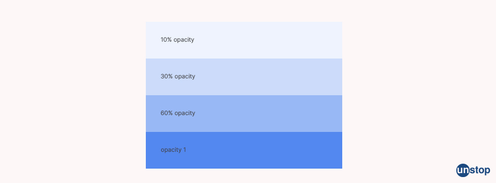
Elements become transparent or see-through because of the CSS opacity property.
The opacity property's value lies between 0 and 1. An element will appear more transparent if the opacity property value is low.
In other words, a value of 0 makes an element totally opaque or fully transparent, while a value of 1 makes an element look as it would normally.
Syntax: opacity: number | initial | inherit;
For example, opacity: 0.5; or opacity: 50%; will set the opacity level to 50%.
Example:
HTML SNIPPET IS HEREPGh0bWw+Cgo8aGVhZD4KICAgIDxzdHlsZT4KICAgICAgICAudHJhbnNwYXJlbnQtYm94IHsKICAgICAgICAgICAgYmFja2dyb3VuZC1jb2xvcjogYmx1ZTsKICAgICAgICAgICAgb3BhY2l0eTogMC41OwogICAgICAgIH0KICAgIDwvc3R5bGU+CjwvaGVhZD4KCjxib2R5PgogICAgPGRpdiBjbGFzcz0idHJhbnNwYXJlbnQtYm94Ij4KICAgICAgICA8aDI+VGhpcyBpcyBhIHRyYW5zcGFyZW50IGJveDwvaDI+CiAgICAgICAgPHA+VGhpcyBpcyBzb21lIHRleHQgaW5zaWRlIHRoZSBib3guPC9wPgogICAgPC9kaXY+CjwvYm9keT4KCjwvaHRtbD4=
OUTPUT:

20. Explain the float property.
This CSS property, float helps us in the positioning and layout of web pages. It is used to alter a regular element's natural flow, specify how an element should float, and position an element on its container. An image is frequently floated to one side and text is wrapped around it using the float attribute. When it is compared to page elements that use absolute positioning, floated elements will continue to follow the page's natural flow.
Syntax: float: none|inherit|left|right|initial;

21. What is Z index?
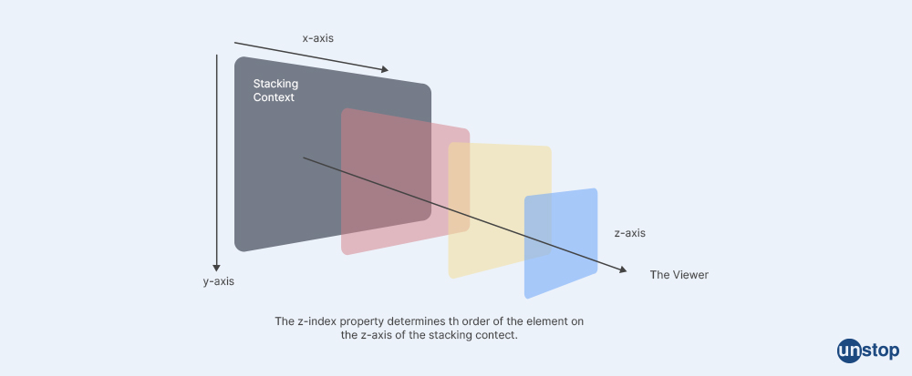
Z index is a CSS property that allows components to be layered in front or behind one another on the z-axis. It specifies the arrangement of the components along the z-axis, or the vertical stacking of components that overlaps. A greater z index value will cause elements to be positioned above elements with a lower z index value. The stacking order of overlapping items, such as dropdown menus, tooltips, and modal windows, can be managed with the use of the z-index attribute.
22. What is a CSS flexbox?
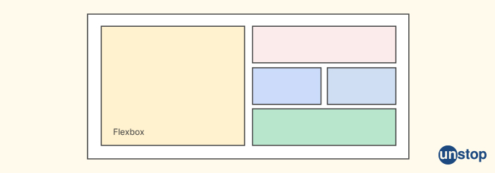
CSS Flexbox is a layout design that allows us to lay out the content of a website. It is built using the display :flex property and it is used to build a one-dimensional layout in CSS.
Flexbox is a type of parent-child relationship, where the flex container can change the width, height, and order of the child elements. Items can grow or shrink to fit the available space and can be aligned and justified within the container.
The flex container can become flexible by setting the display property to flex or inline-flex. The flexbox layout model involves a lot of properties, some of which are meant to be set on the container (parent element, known as “flex container”) whereas the others are meant to be set on the children.
23. What do you understand by cascading in CSS?
In CSS, cascading describes how the browser handles the conflicting CSS declarations. When more than one rule applies to an element, resolving the conflicts between various CSS rules and declarations is done by the process of integrating several style sheets.
The CSS rulesets which are most crucial are reasoned by the browser when they contradict. So, the browsers reconcile conflicting CSS declarations using the CSS Cascade.
24. What are the different CSS position properties?
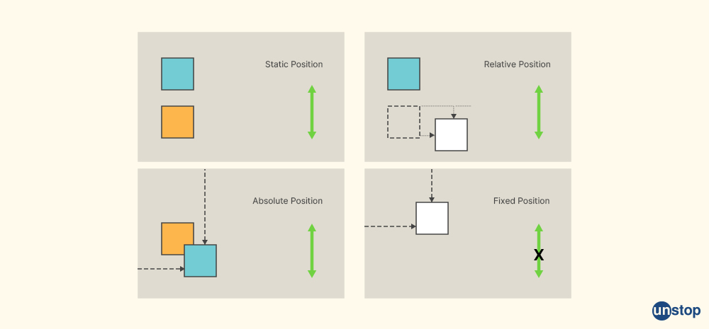
The location of an element on the page is determined using the CSS position value. It establishes an element's location within a document and coordinates with the left, right, top, bottom, and z-index attributes to establish an element's ultimate location on a page.
The different CSS properties with the position values are:
Static: This means that the element is positioned according to the normal flow of the document.
Relative: An element is positioned in relation to its normal position using the relative value.
Absolute: The absolute position value is used to place an element relative to its first positioned (not static) parent element.
Fixed: The fixed value is used to position an element relative to the viewport.
Sticky: Sticky value is used to position an element based on the user's scroll position.
25. When does DOM reflow take place?
DOM reflow happens when the layout of the page changes, like when visible DOM elements are added, removed, or changed, or when CSS styles are altered.
All the elements in the layout tree's positions and dimensions are recalculated throughout the reflow process. The DOM tree nodes which are above and below the modified node will change when a reflow happens.
JavaScript modifications to the DOM, the addition, deletion, or alteration of CSS styles, as well as more complicated rendering modifications like animations, causes the reflow. We can reduce the reflow by eliminating pointless DOM depth, minimising CSS rules, eliminating useless CSS rules, updating classes at the bottom of the DOM tree, and updating all DOM components at once.
26. Tell me about the box sizing property.
The overall height and width of an element can be calculated using the CSS box sizing attribute.
Syntax: box-sizing: content-box|border-box;
The different box-sizing properties are:
Padding is the space between the content of an element and its border.
Borders are the walls that surround the element and it differentiates it from the other elements on the page.
Border-box is the property that is used to include the padding and border in an element's total width and height.
Content box: It does not include padding and border in the width and height of an element.
27. How should a div be centered inside of another div?
If we want to center align a div inside another div, there are many methods available. Some of them are:
Using Flexbox: This method is responsive and doesn't require fixed dimensions. To center a div inside another div using Flexbox, we set the display property of the parent div to flex and then use the justify-content and align-items properties to center the child div.
Example:
.parent {
display: flex;
justify-content: center;
align-items: center;
}
.child {
/* styles for the child div */
}
Using Grid: This method is similar to Flexbox and also it doesn't require fixed dimensions. To center a div inside another div using Grid, we set the display property of the parent div to grid and then use the place-items property to centre the child div.
Example:
.parent {
display: grid;
place-items: center;
}
.child {
/* styles for the child div */
}
Using Margin: This method requires fixed dimensions for both the parent and child divs. So, to center a div inside another div using Margin, we set the margin property of the child div to auto for both the top and bottom and left and right.
Example:
.parent {
/* styles for the parent div */
}
.child {
width: 50%;
height: 50%;
margin: auto;
/* styles for the child div */
}
28. Name @media properties.
The four types of @media properties are:
All: It's the default property that is used for all media-type devices.
Screen: It is used for computer screen, mobile screen.
Print: It is used for printers and print previews.
Speech: This is used for screen readers that "read" the page loud out for visually impaired users.
These properties are used in CSS media queries to apply different styles to different devices or media types.
29. Explain the CSS grid layout system.
CSS Grid is a two-dimensional grid layout technique that allows web designers to utilize positioning and floats when they make sophisticated layouts for websites. The CSS Grid Layout Module provides us with a grid-based layout system with rows and columns, which cancels our need for floats and positioning and make web pages simpler.

30. Describe the ways that you can use to hide the element using CSS.
To hide the element in CSS, we can use the following methods:
display: none: - This property removes the entire element from the page and it can affect the layout of the page.
visibility: hidden: - This property hides the element while keeping the same space.
opacity: 0: - This property makes the element transparent, which helps in effectively hiding the element.
height: 0; overflow: hidden: - This property sets the height of the element to 0 and hides any overflow content which automatically hides the element.
31. What does the :root pseudo-class refer to?
The :root pseudo-class in CSS refers to the highest-level parent element of a given specification. It is used to select the root element of a tree representing the document. The :root selector matches the document's root element, which is always the html element. The :root pseudo-class has more authority than the HTML selector because it is considered as a pseudo-class selector.
32. Tell me about Accessibility (a11y).
Accessibility(a11y) is the process of making digital content and technology usable and accessible for all users, regardless of their device or limitations. It evaluates a computer system's usability for all users and including those who have disabilities or impairments.
The number of letters between the letters "a" and "y" is 11, making the phrase "a11y" a numeronym.
33. Can you restore the default value of a property?
Yes, to restore the default value of a property we can use use the 'initial' property value, which will restore it to the default CSS values.
34. Distinguish between CSS grid and flexbox?
|
CSS GRID |
FLEXBOX |
|
CSS is a two-dimensional grid layout. |
Flexbox is a one-dimensional layout. |
|
It allows elements to be arranged horizontally and vertically. |
It lays out items along the horizontal or the vertical axis |
|
CSS Grid is designed for larger-scale layouts. |
It is designed for small-scale layouts. |
35. What is Calc?
Calc is a spreadsheet program that allows users to organize, analyze, and manipulate data in a tabular format. Calc allows users to perform basic arithmetic operations such as addition, subtraction, multiplication, and division, as well as more complex operations such as statistical analysis, financial modeling, and data visualization.
Calc also offers collaborative work on spreadsheets, multiple-user support, and it also has the ability to save spreadsheets in OpenDocument format.
Example:
.foo {
width: calc(100px + 50px);
}
36. Tell the meaning of CSS custom properties variables.
The CSS Custom properties are entities specified by the CSS writers which hold special values to be reused throughout a document. They are also referred to as CSS variables or cascading variables. We can access them by using the var() method and set them using special property notation, for example,
colour: var(--main-colour)
Custom properties make it simpler for us to handle colour, font, size, and animation values and also help in maintaining consistency across web applications by allowing a value to be stored once and then referencing it throughout the document.
Example:
:root {
--main-bg-color: brown;
--button-color: blue;
}
.container {
background-color: var(--main-bg-color);
padding: 20px;
}
.button {
background-color: var(--button-color);
color: white;
padding: 10px 20px;
}
37. Tell me about { box-sizing:border-box; }, and its benefits.
The CSS rule "box-sizing: border-box;" changes the box-sizing property which is the border box value for all items on a webpage. This implies that an element's width and height will encompass both the padding and border in addition to the content box.
Advantages of box-sizing:border-box are:
- This rule makes it simpler to determine an element's size, particularly when we are using percentages or giving an element padding and borders.
- It guarantees that an element's size will be maintained, independent of the padding or border size. This is helpful for developing responsive designs that must accommodate various screen sizes and devices.
38. Tell me something about !important.
In CSS, when an element has the !important property set then all the future rules on the element are disregarded and the rule indicated by this property is to be implemented.
The !important property raises the priority of the set rule, which means it will take precedence over all earlier styling rules.
SYNTAX:
h1 {
background-color: brown !important;
}
Example of HTML code:
HTML SNIPPET IS HEREPCFET0NUWVBFIGh0bWw+CjxodG1sPgoKPGhlYWQ+CiAgPHN0eWxlPgogICAgLnRleHQgewogICAgICBjb2xvcjogcmVkICFpbXBvcnRhbnQ7CiAgICB9CiAgPC9zdHlsZT4KPC9oZWFkPgoKPGJvZHk+CiAgPGgxIGNsYXNzPSJ0ZXh0Ij5IZWxsbywgd29ybGQhPC9oMT4KPC9ib2R5PgoKPC9odG1sPg==
OUTPUT:
Hello, world!
39. Describe specificity.
Specificity is a means to choose which rule will be applied to the element when there are many CSS rules that target the same element.
The quantity, variety, and arrangement of selectors used in a CSS rule are used to determine specificity. A CSS rule has more weight and is more likely to be applied to an element if its specificity is higher. The specificity of a CSS rule is determined by allocating points to each selector.
39. Explain progressive rendering and how it can be implemented in the websites.
Progressive rendering is a technique that is used in web development to improve the performance of a website by breaking the code of the web page into smaller and more manageable chunks and showing all the available content to the user as soon as possible.
To implement progressive rendering, we can use strategies like lazy loading.
Lazy loading is a technique that loads only the content that is visible to the user. This helps in improving the website performance and saves the system resources.
40. Tell the advantage of translate() over absolute position.
Translate() has several advantages over absolute positioning in CSS.
- Translate() is quicker and more effective, especially when it is used with CSS transitions or keyframe animations.
- Absolute positioning changes the positions of several items, which makes it slower and less effective whereas the translate() only alters the position of a single element.
- Additionally, translate() supports placement down to the sub-pixel level, which leads to smoother animations and transitions. It has no impact on the page's layout, in contrast to absolute positioning, which changes the layout and causes other elements to move.
Therefore, when we are shifting objects as part of a transition or keyframe animation, translate() is typically favoured over absolute placement.
41. How will you know if certain features are supported by a browser?
We can use @support rule to know if the feature is supported by a browser.
The @supports rule operates by determining which CSS property and value pairs are supported by the browser and then applying it to the associated CSS code. It is done only if the test is successful.
As a result, CSS code can be written more effectively and make use of new features without breaking into legacy browsers. In CSS, the @supports rule is used to find features.
42. Tell me the working of absolute positioning.
In CSS, absolute positioning is a technique for locating an element in relation to its closest positioned ancestor and if none of them exists, then it locates in the first contained block.
When an element is absolutely positioned, it is removed from the document's usual flow, so that other components can flow around it without taking up any additional space.
The position of an absolutely positioned element is determined by the top, right, bottom, and left properties, which specify the distance between the element and its nearest positioned parent element or the initial containing block.
The top and bottom properties specify the vertical offset, while the left and right properties specify the horizontal offset.
43. What is work overflow: hidden?
The overflow: hidden attribute in CSS is used to regulate what will happen when an element's content is extended beyond its container.
So, any content that exceeds the container's dimensions is clipped and concealed from view when overflow is set to hidden.
This means that the content is hidden and has no bearing on how the other elements of the page are organized. The overflow property can also be used to set additional values, such as visible or scroll, which add scrollbars to the container and it allows users to scroll through the content when the content exceeds the boundaries of the container.
44. What distinguishes margin in CSS from padding?
Margin: The margin is an area outside of a bordered element. The margin between an element and other items on the page is controlled. It lacks a backdrop colour because it is transparent.
Padding: Padding is the area inside of a bordered element. It regulates the distance between a border's content and that bordered element. We use padding if we want to add space within an element. Padding is impacted by an element's background property color.

45. What do you know about CSS sprites?
A web page that has numerous photos may take longer to load since each image necessitates a separate HTTP request. CSS sprites lessen the amount of HTTP requests and speeds up page loading by merging many pictures into a single file.
46. Explain the term tweening in CSS.
Tweening in CSS refers to the process of creating animations by generating frames between two images or states to create a smooth transition. The term "tweening" is associated with computer animation and products.
In CSS, we can achieve tweening using various animation techniques, like keyframe animations, transitions, and JavaScript libraries like TweenJS. Tweening can be used to create a wide range of animations, such as fades, slides, rotations, and scaling effects.
HTML code example of tweeting:
HTML SNIPPET IS HEREPCFET0NUWVBFIGh0bWw+CjxodG1sPgoKPGhlYWQ+CiAgICA8dGl0bGU+VHdlZW5pbmcgQW5pbWF0aW9uPC90aXRsZT4KICAgIDxzdHlsZT4KICAgICAgICAjdHdlZW5lZC1lbGVtZW50IHsKICAgICAgICAgICAgd2lkdGg6IDEwMHB4OwogICAgICAgICAgICBoZWlnaHQ6IDEwMHB4OwogICAgICAgICAgICBiYWNrZ3JvdW5kLWNvbG9yOiBibHVlOwogICAgICAgICAgICBwb3NpdGlvbjogcmVsYXRpdmU7CiAgICAgICAgfQogICAgPC9zdHlsZT4KICAgIDxzY3JpcHQ+CiAgICAgICAgZnVuY3Rpb24gdHdlZW4oKSB7CiAgICAgICAgICAgIHZhciBlbGVtZW50ID0gZG9jdW1lbnQuZ2V0RWxlbWVudEJ5SWQoInR3ZWVuZWQtZWxlbWVudCIpOwogICAgICAgICAgICB2YXIgcG9zaXRpb24gPSAwOwogICAgICAgICAgICB2YXIgaW50ZXJ2YWwgPSBzZXRJbnRlcnZhbChmcmFtZSwgMTApOwoKICAgICAgICAgICAgZnVuY3Rpb24gZnJhbWUoKSB7CiAgICAgICAgICAgICAgICBpZiAocG9zaXRpb24gPT09IDMwMCkgewogICAgICAgICAgICAgICAgICAgIGNsZWFySW50ZXJ2YWwoaW50ZXJ2YWwpOwogICAgICAgICAgICAgICAgfSBlbHNlIHsKICAgICAgICAgICAgICAgICAgICBwb3NpdGlvbisrOwogICAgICAgICAgICAgICAgICAgIGVsZW1lbnQuc3R5bGUubGVmdCA9IHBvc2l0aW9uICsgInB4IjsKICAgICAgICAgICAgICAgIH0KICAgICAgICAgICAgfQogICAgICAgIH0KICAgIDwvc2NyaXB0Pgo8L2hlYWQ+Cgo8Ym9keT4KICAgIDxoMT5Ud2VlbmluZyBBbmltYXRpb24gRXhhbXBsZTwvaDE+CiAgICA8YnV0dG9uIG9uY2xpY2s9InR3ZWVuKCkiPlN0YXJ0IEFuaW1hdGlvbjwvYnV0dG9uPgogICAgPGRpdiBpZD0idHdlZW5lZC1lbGVtZW50Ij48L2Rpdj4KPC9ib2R5PgoKPC9odG1sPg==
OUTPUT:

47. Explain the universal selector.
The universal selector in CSS is represented by an asterisk (*) and it matches all elements on an HTML page, regardless of their type. It can be used to select all elements or to set a style for all elements inside another element.
48. What particular feature is used to regulate image scroll?
The property that is used to control the scrolling of a background image is background-attachment property. This property sets if a background image will scroll with the rest of the page or will be fixed.
49. Can you tell me about Responsive Web Design?
Responsive web design is an approach that makes the content seem nice on any screen using CSS and HTML to resize, conceal, shrink, grow the content, or relocate the content. It uses a flexible layout.
Responsive Web Design offers an optimal experience, easy reading, and easy navigation to the users with the least amount of resizing on various devices, like PCs, mobile phones, and tablets.
Some components of responsive web design include Flexible grids, flexible layouts, pictures, and deft CSS media queries.
50. What are the different parts of the ruleset?
In CSS there are 2 parts of the ruleset.
Selector: It indicates which HTML element needs to be styled.
Declaration Block: In this block, each declaration is divided by one or more than one semicolon.

51. Name the types of Gradient in CSS.
There are three types of gradients in CSS. They are linear, radial, and conic.
52. Define contextual selector.
A contextual selector is a selector in CSS that considers the context where the style has to be applied. It is made up of two or more simple selectors which are separated by white space and match an element only if it is in the specified context.
53. Explain the class selector.
A class selector in CSS is used to select all elements that belong to a particular class attribute. It is formatted as a period (.) character and which is followed by the name of the class, so it selects all elements with that class attribute so that unique CSS declarations can be applied to those specific elements without affecting other elements on the page.
CSS Syntax for class selector:
element_name {
// CSS Property
}
55. Explain what do you understand by the descendant selector in CSS?
In CSS, a descendant selector is a type of selection process that matches all elements that are children of a certain element. It is also used to select every child element of the specified tag and is composed of two or more selectors that are separated by white space.
56. Do you know what is adjacent sibling combinator?
The adjacent sibling combinator in CSS is represented by the plus sign (+) and it separates two selectors. It matches the second element only if it immediately follows the first element, and both are the children of the same parent.
It is a way of combining two selectors that can be used to select an element that immediately follows another one.
57. What is a Linear gradient?
A linear gradient in CSS is a function that creates an image that consists of a progressive transition between two or more colours along a straight line. It is typically used to create a gradient effect in backgrounds, buttons, and other HTML elements. The linear-gradient() function takes at least two colour stops as parameters.
CSS Syntax for linear gradient:
background-image: linear-gradient(direction, color-stop1, color-stop2, ...);
58. Is it possible to create a rounded corner in CSS?
Yes, it is possible to make a rounded corner in CSS. The border-radius property is used to make rounded corners.
Example:
HTML SNIPPET IS HEREPCFET0NUWVBFIGh0bWw+CjxodG1sPgoKPGhlYWQ+CiAgICA8dGl0bGU+Um91bmRlZCBDb3JuZXJzIEV4YW1wbGU8L3RpdGxlPgogICAgPHN0eWxlPgogICAgICAgIC5yb3VuZGVkLWJveCB7CiAgICAgICAgICAgIHdpZHRoOiAyMDBweDsKICAgICAgICAgICAgaGVpZ2h0OiAyMDBweDsKICAgICAgICAgICAgYmFja2dyb3VuZC1jb2xvcjogI2YwZjBmMDsKICAgICAgICAgICAgYm9yZGVyLXJhZGl1czogMTBweDsKICAgICAgICAgICAgYmFja2dyb3VuZC1jb2xvcjogIzRlOThhNTsKICAgICAgICAgICAgLyogQ2hhbmdlIHRoaXMgY29sb3IgKi8KICAgICAgICB9CiAgICA8L3N0eWxlPgo8L2hlYWQ+Cgo8Ym9keT4KICAgIDxkaXYgY2xhc3M9InJvdW5kZWQtYm94Ij4KICAgICAgICA8cD5IZWxsbywgd29ybGQhPC9wPgogICAgPC9kaXY+CjwvYm9keT4KCjwvaHRtbD4=
OUTPUT:

59. What is a div element?
A div element is used to organize page layout and separate webpages into distinct components for customized design.
To create a <div> element , we add the opening and closing div element tags to an HTML document.
Example:
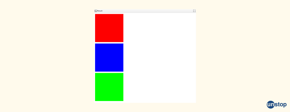
HTML SNIPPET IS HEREPCFET0NUWVBFIGh0bWw+CjxodG1sPgoKPGhlYWQ+CiAgICA8dGl0bGU+RGl2IEVsZW1lbnRzIEV4YW1wbGU8L3RpdGxlPgogICAgPHN0eWxlPgogICAgICAgIC5ib3ggewogICAgICAgICAgICB3aWR0aDogMjAwcHg7CiAgICAgICAgICAgIGhlaWdodDogMjAwcHg7CiAgICAgICAgICAgIGJhY2tncm91bmQtY29sb3I6ICNmMGYwZjA7CiAgICAgICAgICAgIG1hcmdpbi1ib3R0b206IDEwcHg7CiAgICAgICAgfQoKICAgICAgICAucmVkIHsKICAgICAgICAgICAgYmFja2dyb3VuZC1jb2xvcjogI2ZmMDAwMDsKICAgICAgICB9CgogICAgICAgIC5ibHVlIHsKICAgICAgICAgICAgYmFja2dyb3VuZC1jb2xvcjogIzAwMDBmZjsKICAgICAgICB9CgogICAgICAgIC5ncmVlbiB7CiAgICAgICAgICAgIGJhY2tncm91bmQtY29sb3I6ICMwMGZmMDA7CiAgICAgICAgfQogICAgPC9zdHlsZT4KPC9oZWFkPgoKPGJvZHk+CiAgICA8ZGl2IGNsYXNzPSJib3ggcmVkIj48L2Rpdj4KICAgIDxkaXYgY2xhc3M9ImJveCBibHVlIj48L2Rpdj4KICAgIDxkaXYgY2xhc3M9ImJveCBncmVlbiI+PC9kaXY+CjwvYm9keT4KCjwvaHRtbD4=
OUTPUT:
60. How will you control image repetition in CSS?
To control the image repetition in CSS, we can use the "background-repeat" property. The "background-repeat" property sets how background images are repeated.
CSS Syntax for image repetition:
background-repeat: repeat|repeat-x|repeat-y|no-repeat|initial|inherit;
Example:
HTML SNIPPET IS HEREPCFET0NUWVBFIGh0bWw+CjxodG1sPgoKPGhlYWQ+CiAgICA8dGl0bGU+UmVwZWF0IEltYWdlIEhvcml6b250YWxseSBFeGFtcGxlPC90aXRsZT4KICAgIDxzdHlsZT4KICAgICAgICAuY29udGFpbmVyIHsKICAgICAgICAgICAgd2lkdGg6IDYwMHB4OwogICAgICAgICAgICBoZWlnaHQ6IDIwMHB4OwogICAgICAgICAgICBiYWNrZ3JvdW5kLWltYWdlOiB1cmwoJ2h0dHBzOi8vbWVkaWEubGljZG4uY29tL2Rtcy9pbWFnZS9DNEQwQkFRSDVlQ2JTM2dELVNRL2NvbXBhbnktbG9nb18yMDBfMjAwLzAvMTY3MjA0MDI3OTY2Nz9lPTIxNDc0ODM2NDcmdj1iZXRhJnQ9Zk5TRnVibkpDTllDYjNUdjJFVHZEOW5sSFdpYU8zZDE0SE1aN21WSDZ2WScpOwogICAgICAgICAgICBiYWNrZ3JvdW5kLXJlcGVhdDogcmVwZWF0LXg7CiAgICAgICAgfQogICAgPC9zdHlsZT4KPC9oZWFkPgoKPGJvZHk+CiAgICA8ZGl2IGNsYXNzPSJjb250YWluZXIiPjwvZGl2Pgo8L2JvZHk+Cgo8L2h0bWw+
OUTPUT:

61. Do you have an idea about the RGB Values?
In CSS RGB stands for RED, GREEN, and BLUE COLOUR.
In CSS, colours are specified using RGB values and they can be numbered between 0 and 255 or they can also be in the form of percentage between 0 and 100%.
For example, "RGB (255, 0, 0)" represents red colour because red is set to its highest value (255) and the other colours are set to 0.
62. Name the different modules in CSS.
The different modules in CSS are:
- Box-model
- Test Effects
- 2D/3D Transformations
- Selectors
- Backgrounds and Borders
- User Interface
- Animations
- Multiple Column Layout
CSS In A Nutshell
The full form of CSS is Cascading Style Sheets. It is a language for sheets that describe how a document is published in HTML or XML, including XML dialects like SVG, MathML, or XHTML, and is presented. It outlines how elements should be shown in various media, including speech, paper, screens, and other media.
It specifies how HTML elements should be presented, and it is used to style HTML texts. It makes it simpler to maintain websites, exchange style sheets across pages, and adapt pages to various environments by enabling developers to decouple a document's display from its content.
We hope these CSS interview questions will help you ace technical rounds. For more such informative resources, stay tuned to Unstop!
More reads:
- Ways To Find String Length In C++ Simplified (With Examples)
- Competitive Coding: Frequently Asked Questions | Tips For Competitive Coding Events
- 50 Software Testing Interview Questions And Answers You Should Know!
- List Of 50 Core Java Interview Questions With Answers (2024)
- Top 50 .NET Core Interview Questions And Answers 2024
As a biotechnologist-turned-writer, I love turning complex ideas into meaningful stories that inform and inspire. Outside of writing, I enjoy cooking, reading, and travelling, each giving me fresh perspectives and inspiration for my work.
Login to continue reading
And access exclusive content, personalized recommendations, and career-boosting opportunities.
Subscribe
to our newsletter





Comments
Add comment